Case Study
Case Study
User-Centric Website for RIO Money to Drive Engagement and Growth
User-Centric Website for RIO Money to Drive Engagement and Growth
RIO Money is a fintech platform that simplifies digital payments, making transactions secure and seamless for users. With a focus on accessibility and innovation, RIO empowers individuals and businesses to manage their finances effortlessly.
Case Study
User-Centric Website for RIO Money to Drive Engagement and Growth
RIO Money is a fintech platform that simplifies digital payments, making transactions secure and seamless for users. With a focus on accessibility and innovation, RIO empowers individuals and businesses to manage their finances effortlessly.
RioMoney
RioMoney

Challenges
Challenges
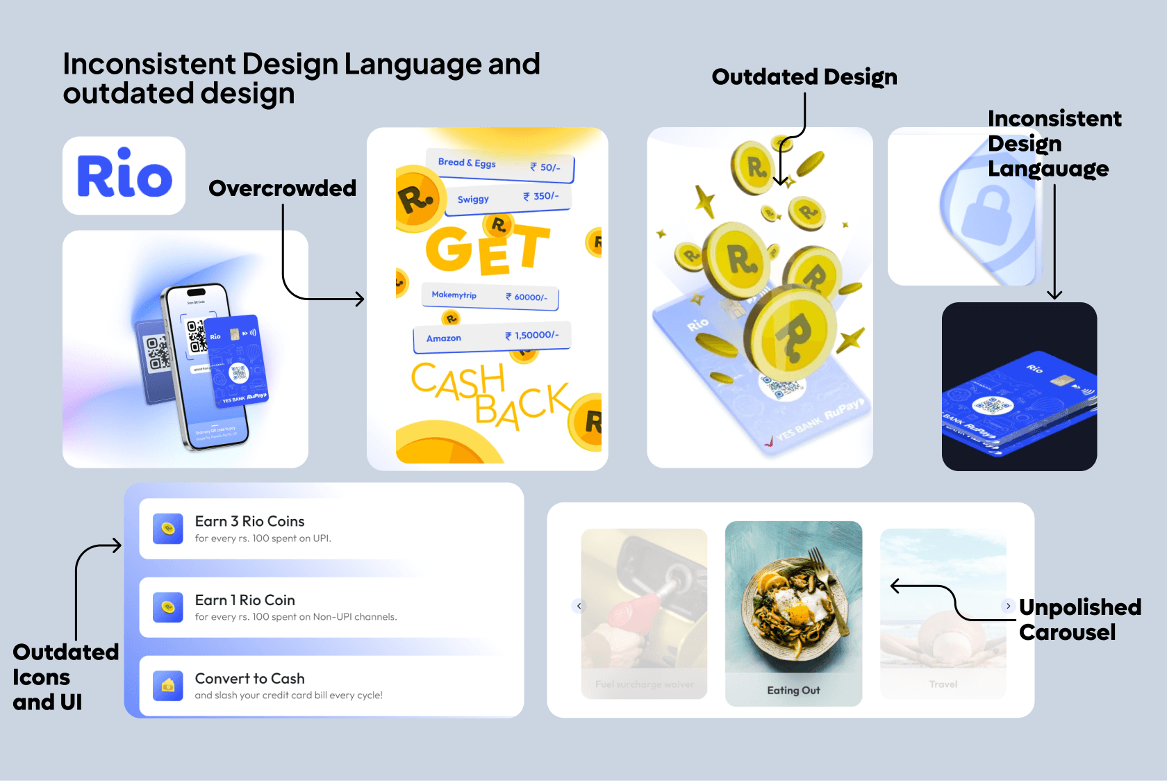
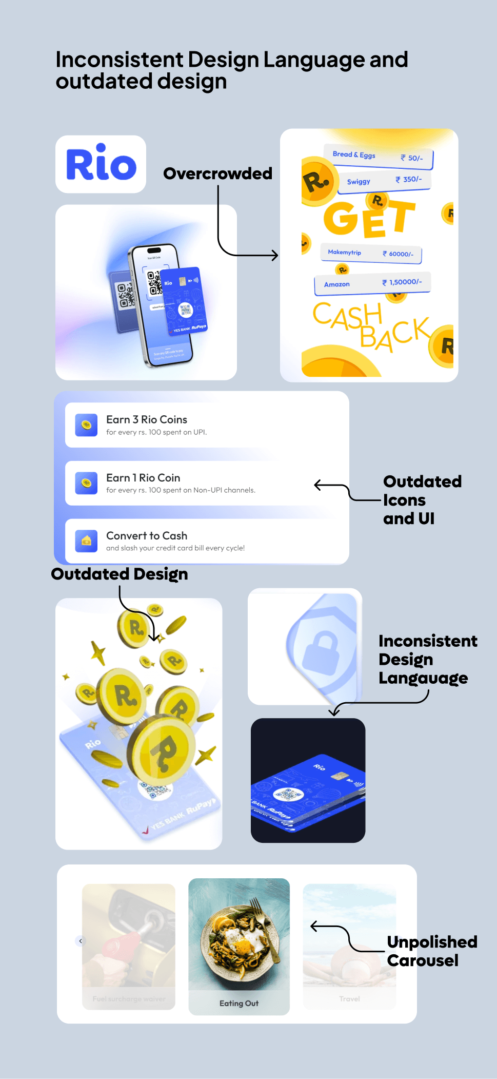
RIO Money needed a website that could:
Effectively communicate the brand’s core values of simplicity, security, and inclusivity.
Provide a smooth user experience, ensuring intuitive navigation for both new users and experienced fintech customers.
Stand out in a competitive fintech market, with an emphasis on trustworthiness and ease of use.
Approach
Approach
Discovery and Research:
Conducted user research to identify needs and preferences.
Analyzed competitors and collaborated with stakeholders to align design with business goals and user expectations.
Building a Brand Foundation:
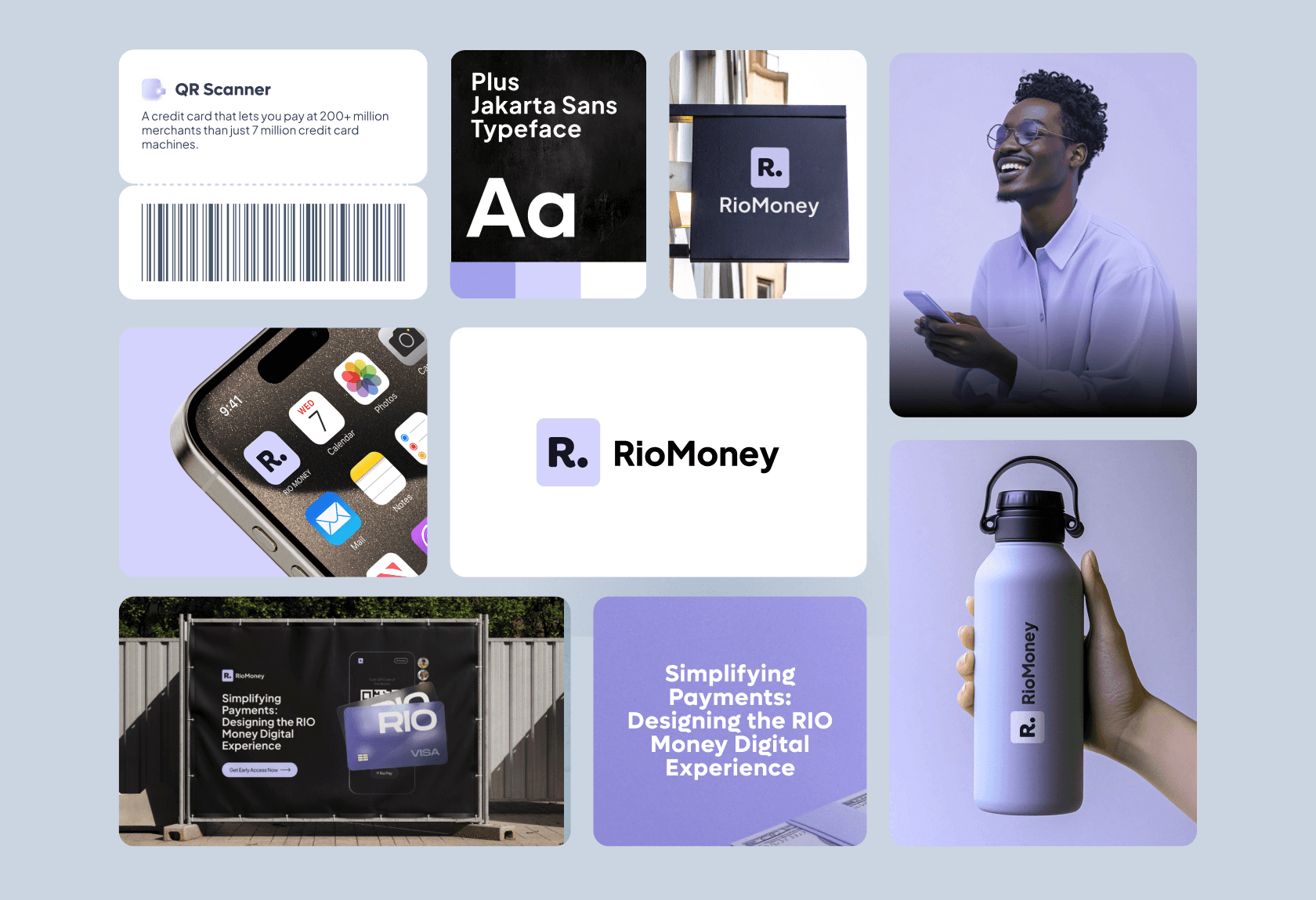
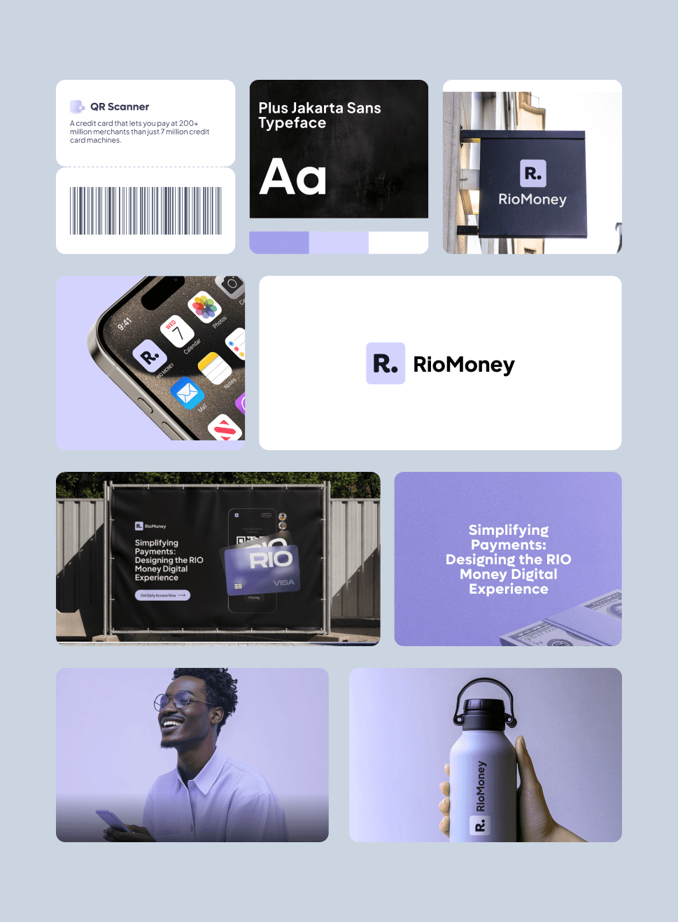
Colors: Chose a palette reflecting trust and innovation, with calming hues and vibrant accents.
Visuals: Opted for minimalistic imagery and subtle animations to convey simplicity and innovation.
Typography: Selected modern, readable fonts that balance professionalism and approachability.
Logo: Refined the logo to represent simplicity, security, and scalability across digital and print.
Design Strategy:
Focused on minimalistic design, strong visual hierarchy, and accessibility for all users.
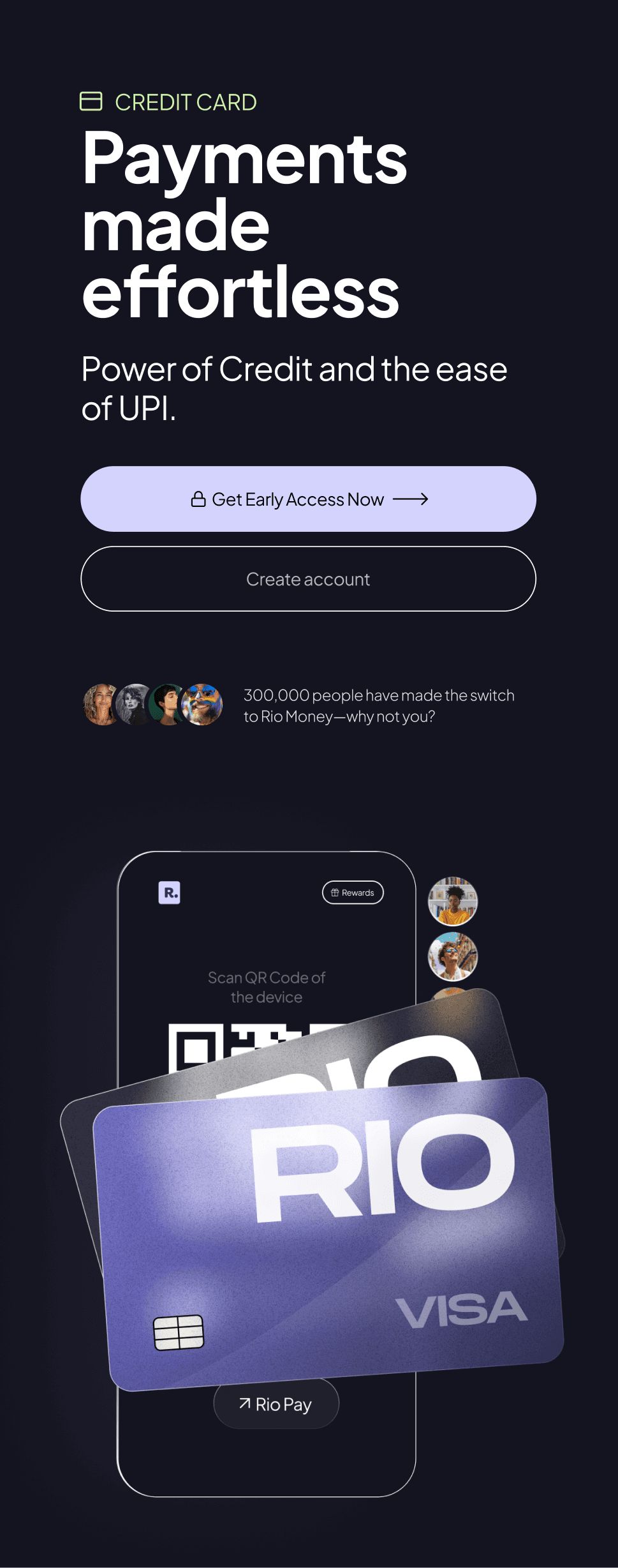
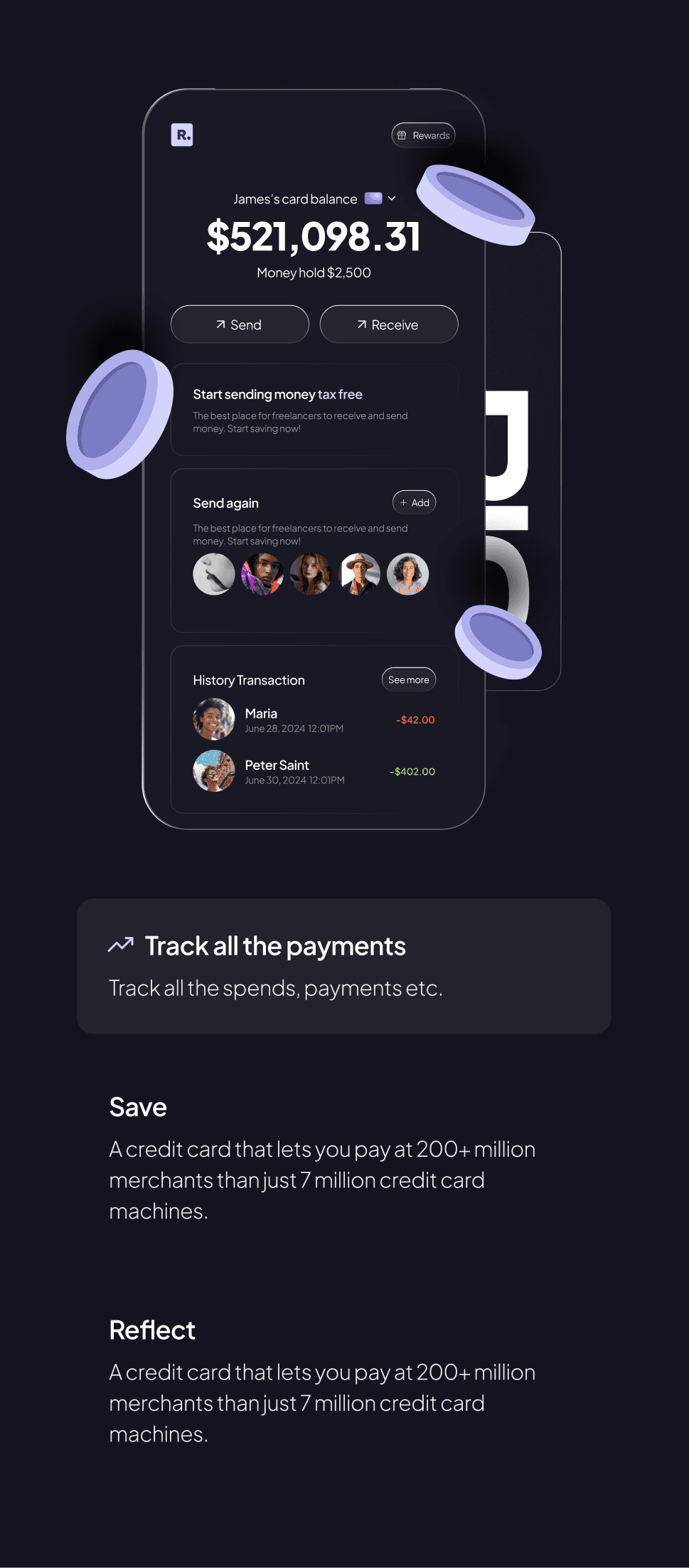
Ensured responsive design for a seamless experience across devices.
Development and Testing:
Collaborated with development teams to implement designs across platforms.
Conducted user testing and iterated based on feedback for optimal usability.

Result
Result
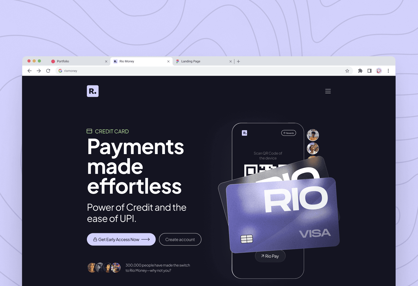
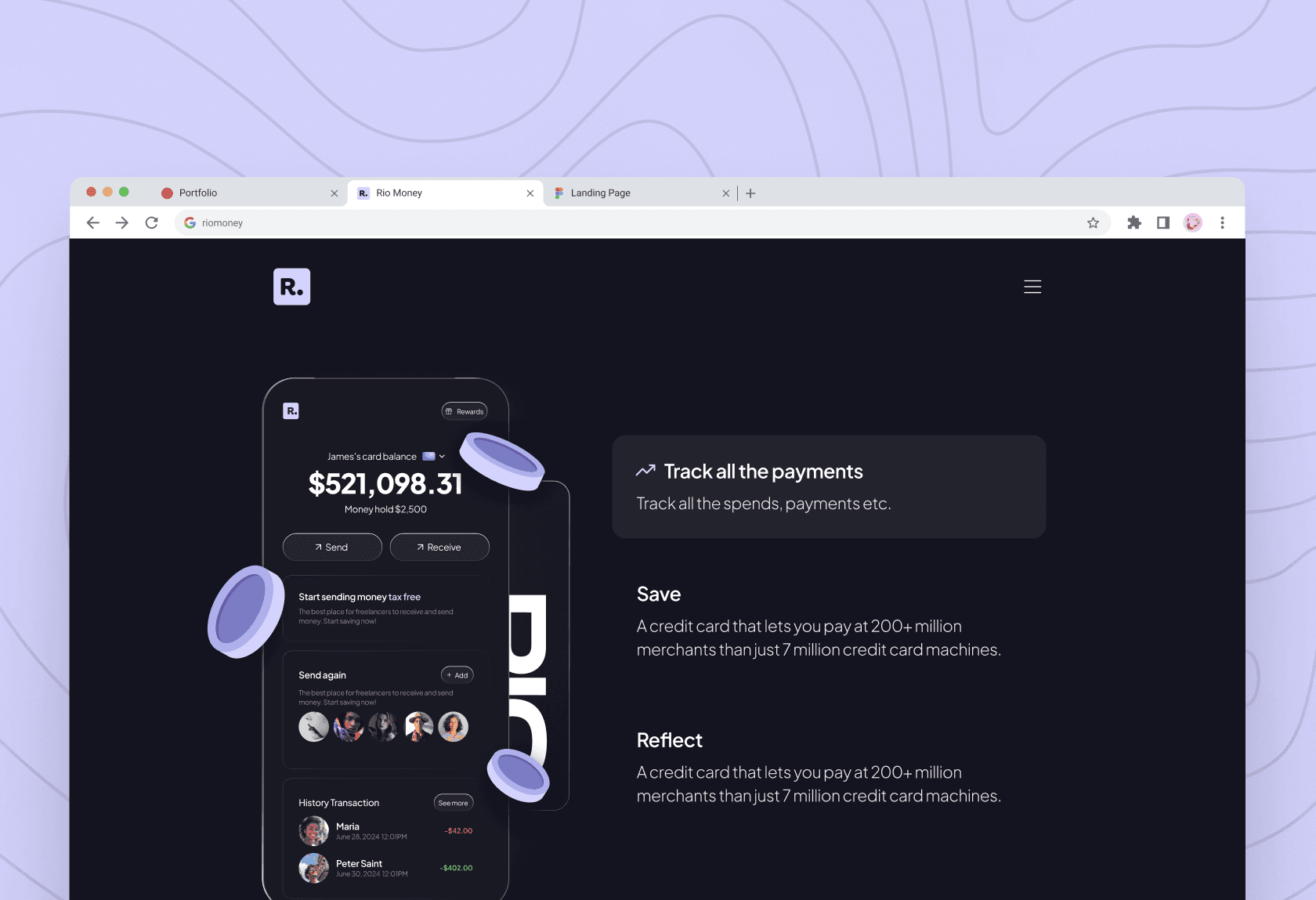
The redesigned RIO Money website now reflects a cohesive and consistent modern design language, addressing previous inconsistencies.
RIO has established a new brand identity that sets it apart from competitors, enhancing its recognition in the market.
The website received positive feedback from RIO’s founders and design evangelists in the industry, highlighting its innovative and user-centric approach.
Successfully positioned RIO Money as a trustworthy, accessible brand in the competitive fintech market.

Conclusion
Conclusion
Working on the RIO Money project was both exciting and rewarding. I enjoyed experimenting with 3D elements and glassmorphism, which helped establish a fresh design language for the brand.
Along the way, I also learned how to use the no-code tool Framer, empowering me to create fully functional prototypes that can be easily shared with developers. This project not only solidified RIO's brand identity but also enhanced my own skills in design and prototyping.
Thanks for checking out my work!
Thanks for checking out my work!
Thanks for checking out my work!
